Overview
I wanted to have my own internet real estate, and that’s what this is. Admittedly, I don’t know yet if I want this website to be a space for me to let myself be unhinged, or a portfolio, or both.
I really like straightforward, no-JS or no-CSS websites that are all about the content, but I also like eye candy or things that make me think, “wow, that may be useless, but it looks pretty and I have no idea how it was done”. I tried to address those two sides the best I could.
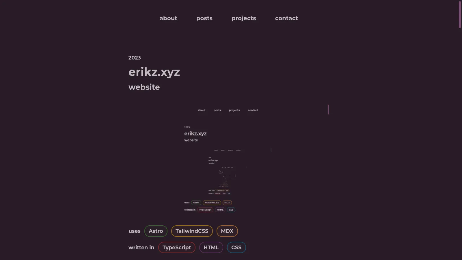
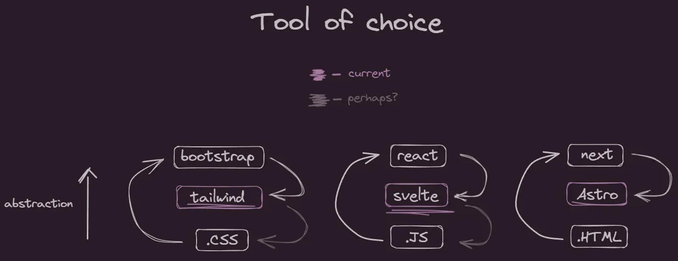
It is statically built with Astro. Despite having previous experience with Next.js, it would be overkill for this website, because it isn’t highly interactive. For the parts that are interactive — and here’s where Astro shines — their “islands” enable you to embed any front-end framework. I decided to go with Svelte in this case. So far, I’ve only used it for the system status card on the main page, and plan to use it for a search util, if I do end up posting more things.
I’m not a huge frameworkbro, and I’m comfortable with vanilla JS, but I was just anticipating the regret of adding more complex features and not having been using a framework from the start. With Astro I could just drop in an island without compromising the rest of the website (I didn’t mean to make it sound like an ad).
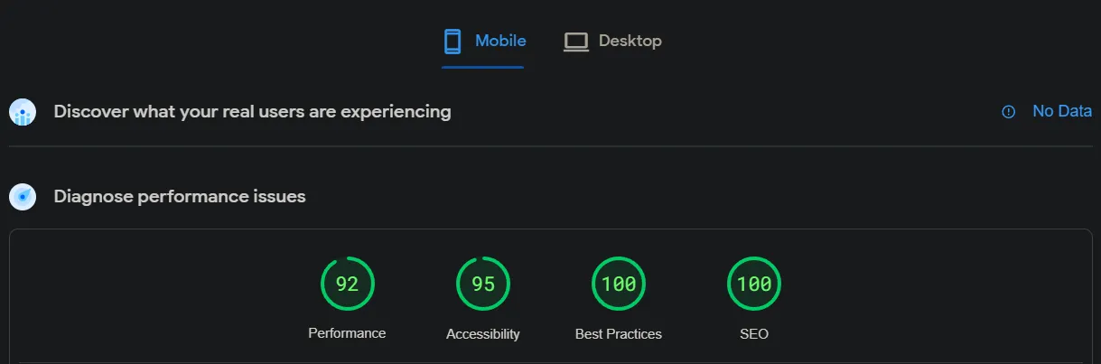
All in all I’ve got what seems like a great score on Lighthouse (PageSpeed Insights):
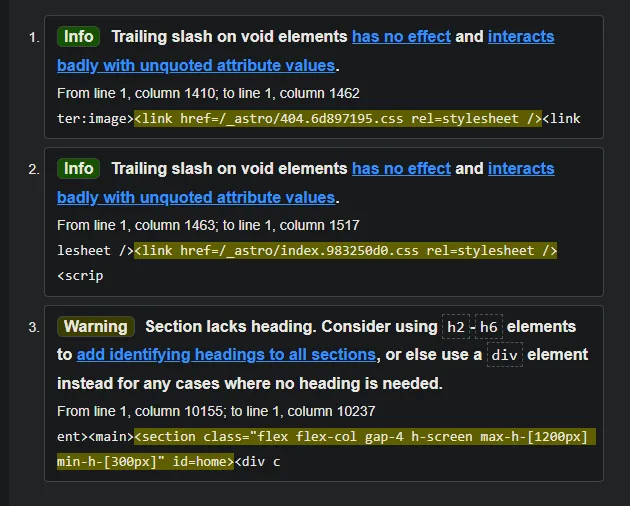
I am not sure if anybody cares but it is also HTML5 compliant:
CSS
Using TailwindCSS also enabled me to get styling done fast, at the cost of some bloat. An example:
<header id="header" class="flex flex-wrap p-6 inset-x-0 max-w-7xl absolute mx-auto font-bold text-base md:text-lg z-20 h-screen max-h-screen md:h-auto pointer-events-none">
    . . .
</header>
It’s messy CSS with extra steps, except it is now directly seen on the HTML. Great! I tried to “componentize” the parts I was going to reuse:
@layer components {
    .c-navbar-item {
        @apply inline-block py-10 md:py-4 px-7 w-full md:w-max text-center rounded-[17px] md:rounded-full hover:bg-secondary-700;
    }
}
At this point, I could just write raw CSS (which I would if I had a weekend with nothing to do). However, it’s nice having somebody choose the values for you so you can magically type px-7 and not padding-left: 1.75rem; padding-right: 1.75rem;.
One thing I don’t get about Tailwind is that creating CSS components is their last suggestion. In fact, this is what they suggest first:
// from https://tailwindcss.com/docs/reusing-styles#loops
<nav>
  {[
    ['Home', '/dashboard'],
    ['Team', '/team'],
  ].map(([title, url]) => (
    <a href={url} className="rounded-lg px-3 py-2 text-slate-700 font-medium hover:bg-slate-100 hover:text-slate-900">
        {title}
    </a>
  ))}
</nav>
So.. we are supposed to have all the repeating classes? So what is all the pride in CSS purging when you have all this repetitive markup?
Well, to be fair even the @apply directive expands tailwind classes into their real counterpart, so I guess there is no escape once you’re using tailwind. This is the output CSS from my component 2 code blocks above:
/* output CSS */
.c-navbar-item{
  display:inline-block;
  width:100%;
  border-radius:17px;
  padding:2.5rem 1.75rem;
  text-align:center
}
.c-navbar-item:hover{
  --tw-bg-opacity:1;
  background-color:rgb(110 94 108/var(--tw-bg-opacity))
}
@media (min-width:768px){
  .c-navbar-item{
    width:-moz-max-content;
    width:max-content;
    border-radius:9999px;
    padding-top:1rem;
    padding-bottom:1rem
  }
}
All of that brings me to reflect on how I’ve been using tooling for web development.
Markdown
The posts are written in Markdown, or rather an extension of it, MDX, that understands embedded HTML or JS.
I am syncing them across devices with syncthing, which means that I can access or edit content offline, especially useful when something pops into my mind when I have no internet. You can also get syncthing working beyond LAN (local network) using a VPN, like I do, meaning I can continue syncing devices even if I’m out of home, but it’s usually not a lot of stuff anyway so I never have to do that.
Using markdown means I can use ObsidianMD, which I was obsessed over in my second brain era, which I’ve gotten past, so on the desktop I rather prefer editing directly with nvim or VSCode.
If I had a bigger website, I would eventually consider ISR (Incremental Static Regeneration). Currently, the entire website is rebuilt, even if only one page was updated. ISR would only rebuild pages that were changed at all. Ironically, none of the articles detailing how to do it are from the Astro docs themselves, so I don’t think it’s a thing in Astro yet, but can be faked with caching and cache invalidation.
Intro animation
Made with GLSL shaders, meaning it will run smoothly on the GPU. At first I used Three.js following this post with a not very inviting title. However I eventually realized using Three.js was overkill, so I rewrote the code in WebGL. It has a 98% coverage so it should render on the vast majority of devices. I don’t know if Three.js has a fallback for devices that do not support it or if it is even worth maintaining that code.
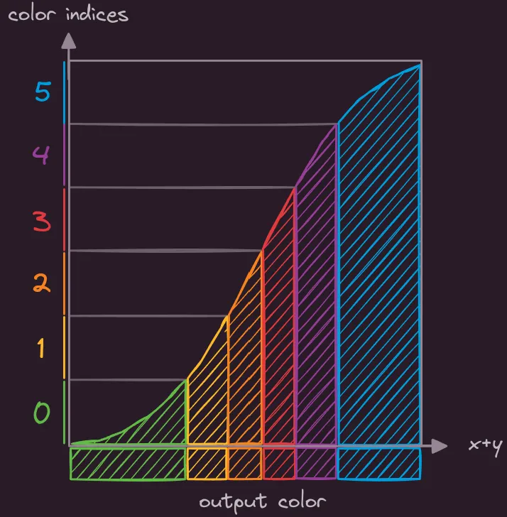
The whole thing is just a rectangular surface with 2 triangles and a fragment shader. It maps the sum of the x, y coordinates to a cubic function so that there is some warping as it crosses the center. It would’ve worked just as well for a linear function but I wouldn’t get that effect, which turned out to not be that noticeable. This output is then offset by a factor of time, then by some cumulative sum of mouse movement, and finally floored to become an integer that can index an array with the theme colors.
(actually, for a slight tilt, you would want a rotation (e.g. ), which is what I did, or multiplying at least either coordinate by some factor)